
0%
UVIO
Isagenix logo

Isagenix - e-commerce UX/UI redesign

Making a global wellness store easier to shop, faster to scale and better at converting.

Project at a glance

Overview
Global e-commerce website and internal partner platform
Scope
200+ screens and 10+ new features
Our role
UX research, product design, UI design, prototyping, usability testing, design system
Reach
500K+ users impacted
Industry
E-commerce, Health & Wellness
Timeframe
1 year+

Introduction

Isagenix is a global wellness company selling nutrition, weight management and personal care products across more than 20 markets. The platform already served a huge audience, so even small UX decisions could have a real impact on sales and everyday customer experience.

The goal was not to redesign everything for the sake of redesigning it. We focused on the parts of the shopping experience that mattered most, improved how the design team worked internally, and built a system that could support the product long after individual screens were shipped.

Problem

At this scale, the challenge was not a lack of features. It was making hundreds of existing and new experiences feel simple, consistent and easy to maintain.

Important shopping decisions were sometimes buried too deep, catalog browsing needed more control, complex product packs had to become easier to configure, and every new feature added more pressure on an already large product ecosystem. At the same time, design and development needed a faster way to stay consistent across all of it.

How we solved it

  1. Understand before changing

    LEARN THE CONTEXT

    We worked closely with product owners, business analysts, and developers to understand business goals, user behavior, and technical constraints before changing the interface.

  2. Design around real behavior

    VALIDATE THE EXPERIENCE

    Ideas moved through wireframes, prototypes, and usability testing so decisions were based on how people actually use the product, not just what looked better.

  3. Improve continuously

    REFINE THROUGH USE

    Features were shipped, observed, and refined through Agile sprints as new feedback and usage data came in.

  4. Build a system

    DESIGN FOR SCALE

    Alongside product improvements, we created an enterprise-level design system so new features could be designed and developed faster without losing consistency.

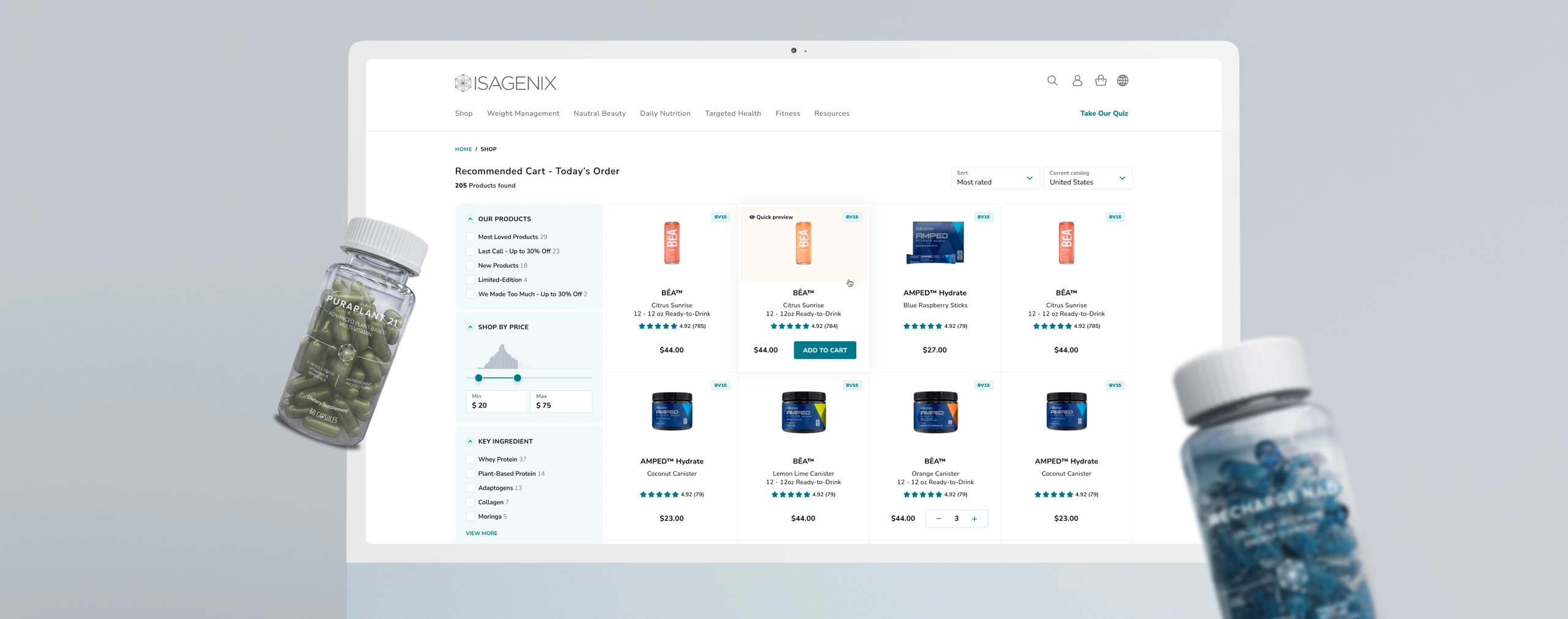
Product Page

Research showed that the most important buying actions were sitting too deep on the page.

Users had to scroll before they could choose a flavor, product type, quantity or even add the product to cart.
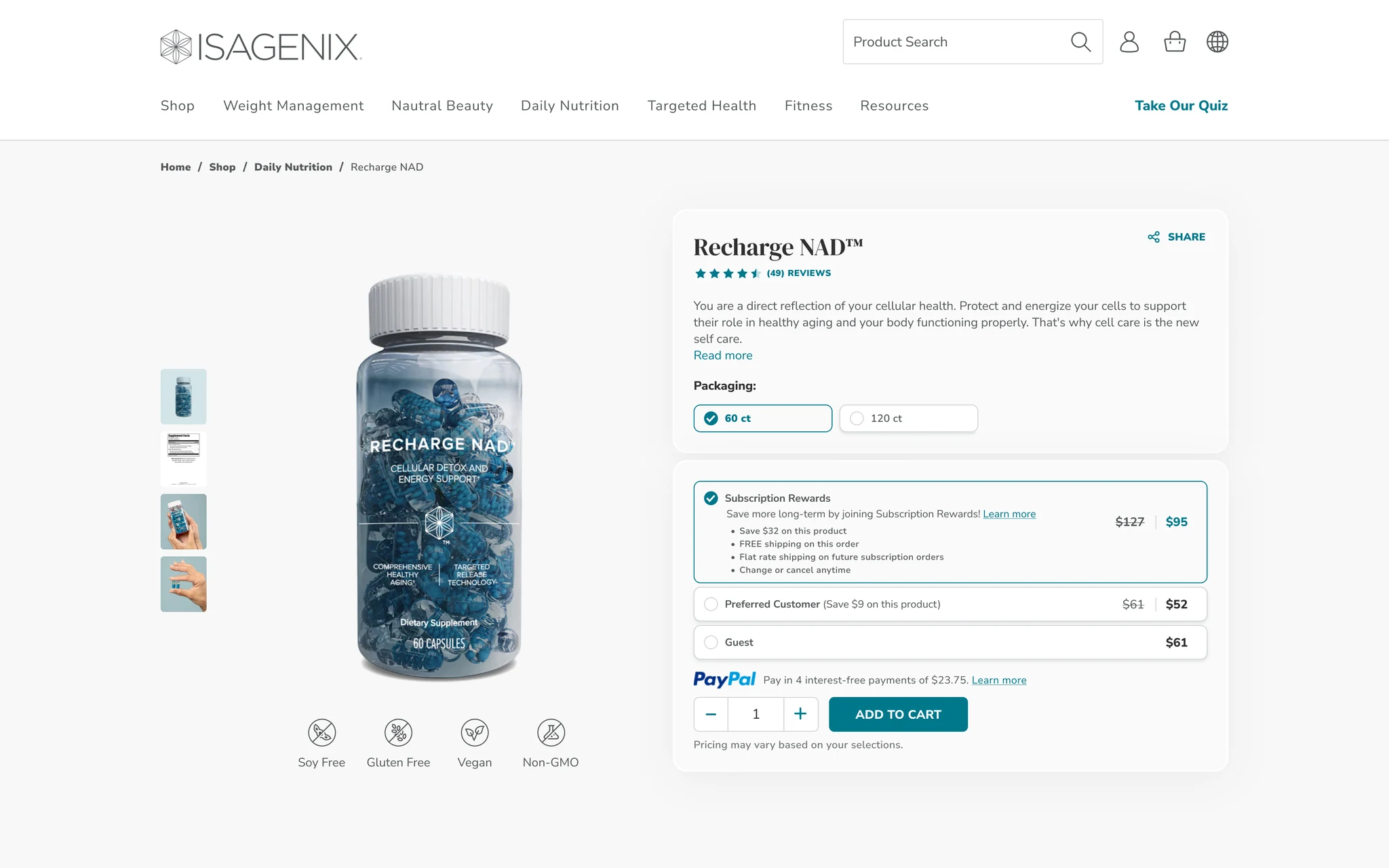
Product Page screen

What we changed

  • Added filters for price, flavor, ingredients and dietary preferences.
  • Added sorting to make large product lists easier to scan.
  • Introduced quick product preview without leaving the catalog or losing selected filters.

Impact

Users can compare and discover products much faster while staying in the same flow. For the business, that means less friction between browsing and buying.
Pack Configurator

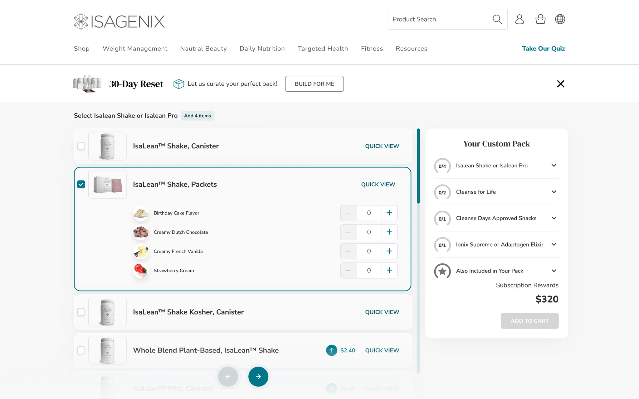
Building a product pack meant choosing several products, quantities and flavors in one order.

Without a clear structure, that could quickly become confusing and lead users to abandon the process.

Pack Configurator screen

What we changed

  • Broke the configuration into clear steps instead of showing every choice at once.
  • Made selected products, quantities and flavors easy to review as the pack is built.
  • Kept users aware of their progress and what still needed to be completed before checkout.

Impact

The new flow made complex packs much easier to understand and buy. Product pack sales increased by 22%, turning a UX improvement into a measurable business result.

Orders

Order history should not feel like an archive.

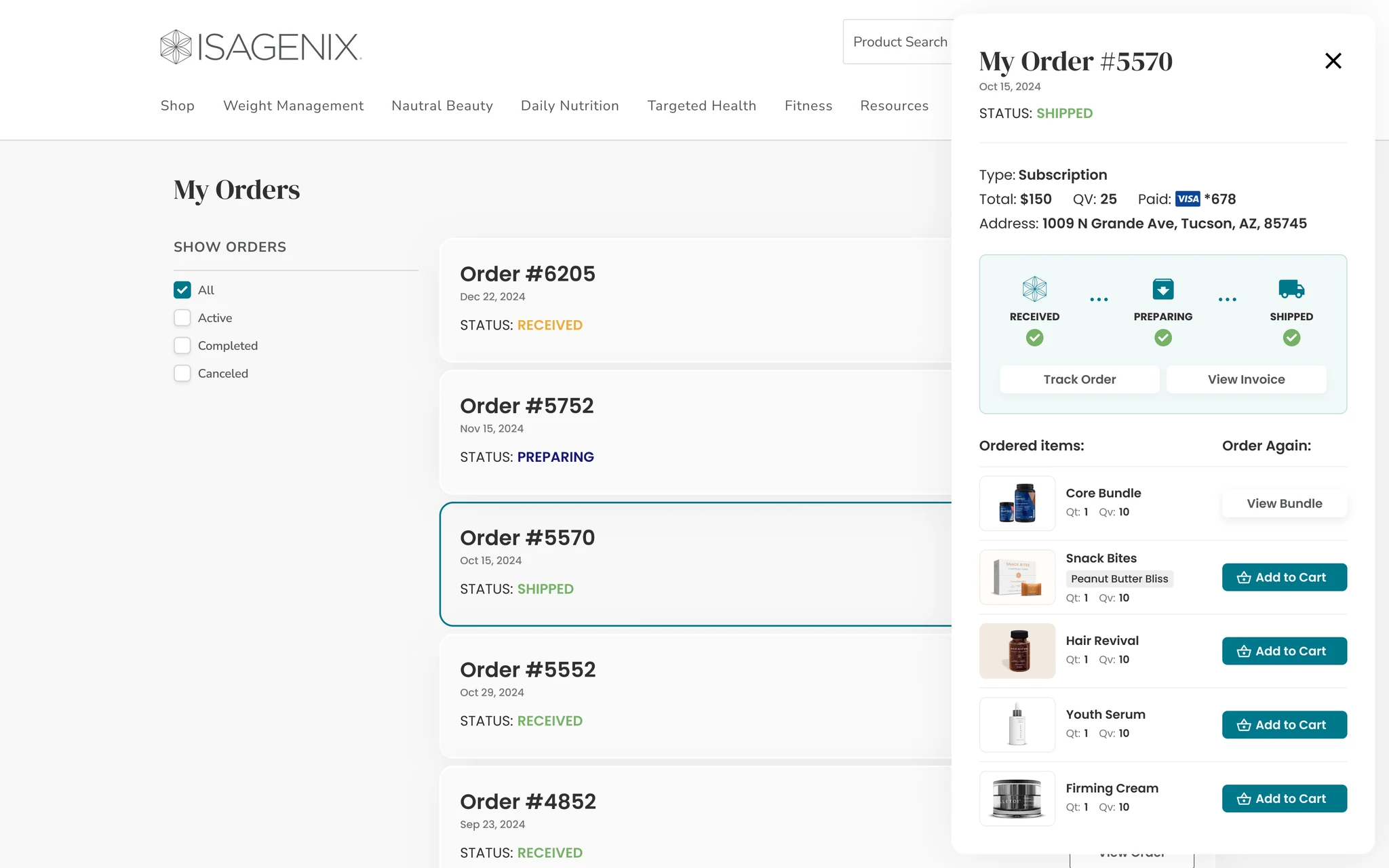
We redesigned it around the questions users actually have: where is my order, what did I buy and can I order it again?

Orders screen

What we changed

  • Made current order status clear at a glance.
  • Kept order history and details easy to scan.
  • Added a simple reorder path for products users buy regularly.

Impact

Users spend less time searching for order information and can repeat purchases faster. For the business, that means a smoother post purchase experience and an easier path to recurring sales.

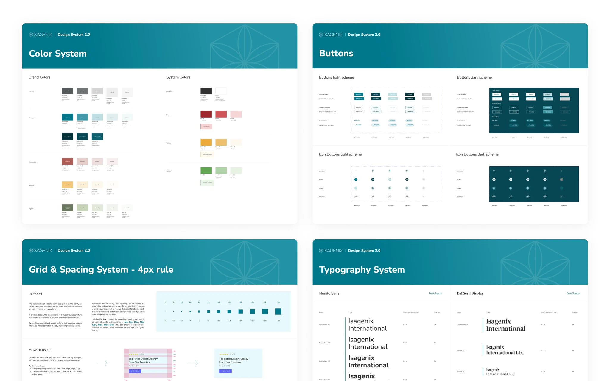
Design System

With 200+ screens and new features constantly being added, consistency could easily become a bottleneck.

We created a scalable design system that gave both design and development teams one shared set of rules and components.

Design System screen

What we focused on

  • Built reusable components for both the customer website and internal partner platform.
  • Defined states, patterns and behavior instead of redesigning common elements every time.
  • Created one visual language that stays consistent as the product grows.

Impact

New screens and features became around 3x faster to design and develop, while keeping the experience consistent across the whole product.

Results

The redesign touched more than 200 screens, introduced 10+ new features and improved the experience for over 500,000 users.

The clearest business result was a 22% increase in product pack sales. At the same time, the new design system made future design and development around 3x faster.

For us, this is exactly what good product design should do: make things easier for users and create measurable value for the business.

Clarity is what moves products forward

Start with
a clear next step

We’ll help define a clear path forward

Tell us what you're building